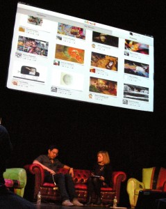
Khoi Vinh, cofounder and CEO of Lascaux Co, demoing Mixel, his new iPad app, to design critic Alice Twemlow.
Should Portland, Oregon be our touchstone for the future or the past? “The dream of the 90s is still alive in Portland” sings the anthem for the hit TV show Portlandia, celebrating the city as a cultural cul de sac stuck in another age. Then there’s WebVisions, a tech conference that originated in Portland twelve years ago and came to New York for the first time in January. Its charge: to explore what tools and principles will define our interactive experiences in the future. And with a panel on Portlandia, a soundtrack exclusively filled by local bands, and many speakers from Portland–it was also about Portland as a colonizing meme.
The brainchild of Brad Smith, founder of Hot Pepper Studios, WebVisions believes that whether you are using a webpage, a mobile device, or a tablet, everyone today competes based on who delivers the best experience. User experience (UX) was the connecting theme throughout two days of presentations about web and mobile design, digital media, and technology. As UX designer Whitney Hess put it, “User experience is the establishment of a philosophy about how to treat people.” Collectively, the speakers demonstrated that delivering a great user experience involves many components: interface design (what you see), interaction design and user research (what you should do, what you do, and what happens then), and information architecture (the data structures and navigation that support and organize what you experience).
Nathan Shedroff, author of Design Is the Problem and co-author of Making Meaning: How Successful Businesses Deliver Meaningful Customer Experiences, kicked off the conference in futuristic fashion with “Make It So: UX Lessons from Science Fiction.” Shedroff has been researching the connection between science fiction on film and television and UX for several years and the result will be published in Make It So: Interaction Design Lessons from Science Fiction, coming from Rosenfeld Media later this year. One of the most striking examples of the UX/Scifi intersection occurred in 2000 when Douglas Caldwell, an engineer with the U. S. Army Topographic Laboratory, was dragged by his son to watch the movie X-Men. Caldwell was stunned to find that the life-size 3D map the mutants were using to plan their attack was an advanced vision of what he was charged with developing: the ”sand tables” military personnel use to mimic the terrain on which planned military maneuvers take place. Caldwell credits the scene with leading to the development of the Xenotran Mark II Dynamic Sand Table.
Cyborg anthropologist and UX designer Amber Case, founder of Geoloqi, entertained attendees with a tour of the history and current state of ambient computing. Wearable computers date back to the 1960s and Steve Mann ’s notion of a wearable wireless webcam (1994) seems to becoming a reality with the recent reports of “HUD Google glasses” being in development. Geoloqi focuses on developing apps that integrate a user’s location, the time of day, the user’s speed of movement, his or prior actions (clicks, subscriptions) and a user’s friends into a shared experience. During lunch at WebVisions volunteers downloaded GeoLoqi’s app MapAttack and formed teams to play a real-time game in which players used their cell phones to gain points by being the first to capture “geofences,” GPS-defined areas, in Central Park.
As conference sponsor and publisher Louis Rosenfeld noted in an interview with PT (see interview here): “User experience is really about good communication.” Whitney Hess drew on her experiences as an independent UX designer who specializes in startups to talk about “Design Principles: The Philosophy of UX”. Much like Donald Norman, Hess collects examples of good and bad design and she encourages the thousands who follow @whitneyhess on Twitter to send examples they find. Principles like contrast, emphasis, movement, texture, harmony, and unity becomes more understandable when illustrated by a web page (her presentation is on Slideshare.net) For a design to succeed, according to Hess, it must deliver a good experience. Hess went beyond visual design principles to develop her own ten principles of experience design: Stay out of people’s way; create a hierarchy that matches people’s needs; limit distractions; provide strong information scent; provide signposts and cues; provide context; use constraints appropriately; make actions reversible; provide feedback; and make a good first impression.
Hess quizzed attendees to see if they could identify a company based on its published design principles. Few could. Hess urges every company to craft its own design principles based on business goals, user needs and brand attributes. Crafting your own design principles helps you distinguish your design from your competitors—you’ll know if it’s working if it helps you to say “no”. Best time to use your principles? How about when prioritizing features, during design critiques, or when you’re trying to resolve conflicts.
WebVisions featured one panel with two bona fide New York design celebrities: “Design + Entrepreneurship” brought together Alice Twemlow, author of What Is Graphic Design For? and cofounder of the Design Criticism MFA program at the School of Visual Arts, and Khoi Vinh, co-founder and CEO of Lascaux Co. Vinh had been design director of NYTimes.com for four and a half years when, two years ago, he left to start a new venture. He spent $10,000 of his own money to develop the prototype for Mixel, a free app for the iPad that Vinh calls the “first social collage app.” Designed to encourage artists and non-artists to create and share art, Mixel encourages users to upload artwork and then “remix” it in collages with other people’s art, Mixel tracks how often the artwork has been remixed and where on the Web it appears. Vinh’s insistence that Mixel’s users be “real people” led him to require a Facebook login, which has upset some artists, but many find the app “stupendously addictive.”

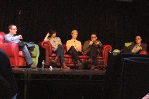
Vince Porter of the Oregon Governor's Office of Film and Television; Carrie Brownstein; Claire Evans, Portlandia blogger; Fred Armisen; Blake Callaway of IFC
The highlight of the second day was a panel on Portland’s most famous recent export, Portandia,and featured its two stars, Fred Armisenfrom Saturday Night Live and Carrie Brownstein, formerly of Sleater-Kinney and current lead guitarist/singer with Wild Flag. The show began its second season on IFC in January. The first season consisted of just five episodes and was shot in August-September 2010 for a budget of less than a million. Lean and location-based, Portlandia also raises the question: isn’t all comedy about interaction design? Armisen and Brownstein write all the sketches. “We get a real benefit from having a nimble crew,” observed Brownstein. “For the second season we did 170 locations in nine weeks.” “The whole friendship thing is a lie, an affectation,” noted Armisen on his relationship with Brownstein. “We don’t enjoy anything we do. It’s more an obligation.”
Mozilla UX designer Crystal Beasley offered her own collection of practical UX tips. Basing her talk on “common things I have heard come out of people’s mouths when heading for a bad UX design,” she crafted “13 Signs Your UX Needs an Exorcism.” Some of the highlights included:
- “I’ve got this really great idea for a site.”This is the sound of a solution in search of a problem; start with peoples’ needs and frustrations
- “I’ve got this really great idea for a feature.” Features add complexity. Make sure you’re optimizing for tasks that 80% of users need and use A/B testing to make sure.
- “I think the button should be on the right.”Test with real people to escape your biases.
- “I don’t want the user to do the thing they want to do.” Why? Fighting your users never wins. Time to rethink.
- “Maybe we need a FAQ.” The most important information should be obvious.
- “Let’s split this up into different steps so it seems smaller.” Don’t lie. Make the flow smaller. Every field you ask for reduces conversions.
- “Make it red so it will really stand out.”Red does stand out. That’s why you should only use it for error text and critical system warnings.
Beasley’s presentation is available on Slideshare.net.
Delivering a great user experiences assumes some effort has been spent on user research and usability testing. But In his keynote address, “Beyond User Research,” Louis Rosenfeld drew on his ten years as an IA consultant to lament how dysfunctional organizations are in how they do research. Too often the quants (analytical folks) and the “quals” (creative/marketing folks) work in different silos. Silos cause organizations to not only overpay for research, but waste time and energy in duplicated efforts and miss the combinatorial effect of a joint effort. Web analytics can inform the user experience. “Use natural language questions” when doing analysis, Rosenfeld urged, to focus on what’s important: who searched and when? What did they search for? Where did they search? “Add what people are searching for to whatever personas you are creating.” Land’s End saw no need to add sku numbers to its website until it noticed that customers were entering the sku numbers from its print catalog into search in order to find exactly what they wanted. Rosenfeld’s presentation is on Slideshare.net.
PT thanks online marketing and content development consultant Rich Kelley (@rpmkel) for this report. Rich is also VP and Strategic Partner with the new startup Your Expert Nation.


